

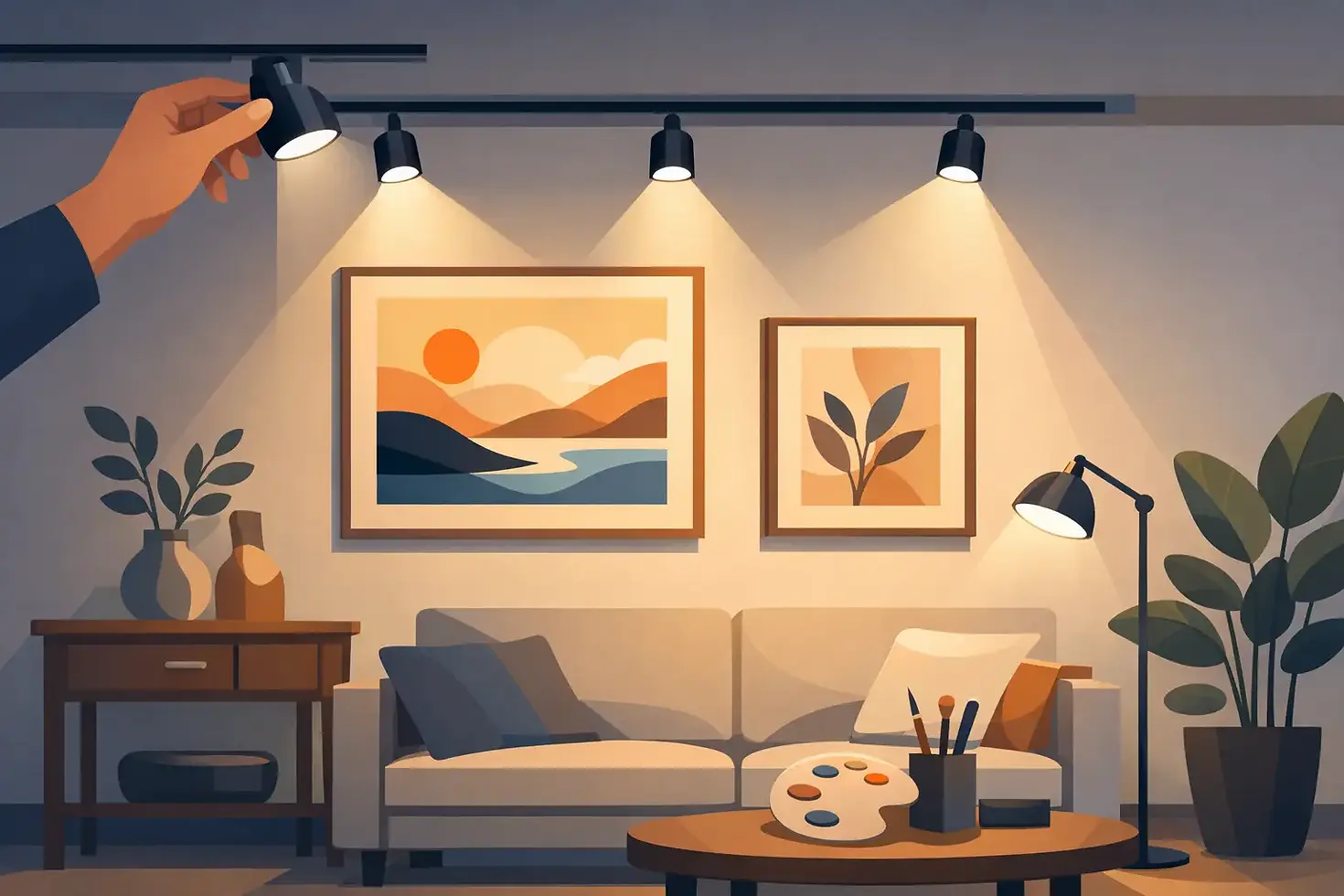
How to Light Artwork Properly in Your Home

A painting can be exquisitely framed, thoughtfully placed, and still disappear after sunset. The difference is rarely the artwork itself. It is the quality, direction, and restraint of the light around it. Knowing how to light artwork properly allows a collection to hold its visual presence at night without flattening its color, creating glare, or introducing unnecessary risk to an irreplaceable surface.
Artwork lighting is not simply a matter of adding a picture light. It is a calibrated design decision that considers the piece, its medium, the architecture, the viewing distance, and the atmosphere of the room. A luminous abstract canvas, an antique oil portrait, a textile, and a sculptural wall relief each ask for something different.
How to Light Artwork Properly: Start With the Art
Before selecting a fixture, study what is being illuminated. Size matters, but material matters more. Glossy varnish, glass, metallic leaf, and polished framing can reflect a lamp directly back to the viewer. Watercolors, photographs, textiles, and historic works may be especially sensitive to light exposure. A lighting plan should respect both visual impact and conservation.
For a large canvas with a matte finish, a controlled directional fixture may reveal color and brushwork beautifully. For a framed photograph behind glass, the same approach can create a bright, distracting reflection. In that case, the fixture location, aiming angle, and surface finish must work together to keep the source outside the viewer's reflected sightline.
Consider how the artwork is meant to be experienced. Is it the quiet focal point of a library, the first visual gesture in an entry, or part of a layered gallery wall? A single significant work often benefits from precise, individual illumination. A collection may need a more unified wash of light that gives every piece presence without turning the wall into a row of isolated spotlights.
Choose Light That Renders Color Faithfully
Color rendering is one of the most consequential specifications in art lighting. A fixture can appear bright while still distorting the reds in an oil painting, dulling blue pigment, or making warm paper appear gray. Look for high-quality LED sources with a color rendering index of 90 or above. For exceptional color fidelity, a CRI of 95 or higher is often preferable, particularly where art, fine finishes, and natural materials share the same visual field.
CRI is useful, but it is not the entire story. A source should also have strong red rendering, often identified by an R9 value, because reds and warm skin tones can look noticeably incomplete under lower-quality LEDs. When a project contains richly colored art, stained wood, hand-finished plaster, or antique furnishings, this level of technical clarity supports the artistic vision rather than competing with it.
Color temperature should complement both the art and the interior. In many residential settings, 2700K offers a warm, intimate quality that suits traditional paintings, layered interiors, and evening entertaining. A 3000K source can feel slightly cleaner and may be appropriate in contemporary homes, galleries, or spaces with cooler architectural finishes. The right choice depends on the palette of the work and the ambient light throughout the room.
Consistency is essential. A beautiful painting can look strangely disconnected when it is lit at 3000K while the surrounding room is lit at 2700K. Unless contrast is intentional, art lighting should feel integrated with the larger composition of the interior.
Use Beam Angle and Placement to Shape the View
The fixture needs to cover the work evenly, but it should not spill aggressively onto adjacent walls, ceilings, or furnishings. Beam angle determines the spread of light, while fixture placement determines whether that beam arrives at the artwork gracefully.
A narrow beam may create an attractive emphasis on a small sculpture or a modest work on paper, but it can produce hard falloff across a larger canvas. A wider beam is often better for broad artwork, provided it remains controlled enough to avoid washing the entire wall in undifferentiated brightness. The goal is not simply illumination. It is proportion.
For recessed or track-mounted accent lighting, a common starting point is to position the fixture so its light strikes the art at approximately 30 degrees from vertical. This angle often reduces shadows cast by the frame and helps limit reflections. It is a starting point, not a rule. A heavily textured painting may benefit from a slightly more angled approach that reveals its surface. Artwork behind glass may require more careful adjustment to prevent reflected glare.
The height of the ceiling, the depth of the frame, and the normal viewing position all affect this calculation. In a custom home, these variables should be resolved during the lighting plan and drafting phase, before junction boxes and ceiling details are fixed. Moving a fixture by even a few inches can change whether a piece reads as luminous or poorly aimed.
Picture Lights Offer Character, Not Always Complete Coverage
A picture light can add a refined, furniture-like detail to an interior. It is especially effective when its form is part of the composition, such as a traditional brass fixture above a portrait or a tailored, custom-finished light over a curated collection. Yet picture lights are not automatically the best technical choice.
On a large piece, an undersized picture light may create a bright band across the upper third of the artwork and leave the lower area dim. It can also introduce glare on glossy surfaces if the shade and mounting position are not carefully selected. Integrated LED picture lights with proper shielding and dimming can perform beautifully, but they should be specified for the artwork's dimensions rather than chosen as decorative accessories.
For a cleaner architectural result, recessed adjustable fixtures or discreet track systems can provide more precise aiming and more even coverage. The strongest solution may use both: ambient architectural lighting to establish the room and dedicated art lighting to give the collection its rightful emphasis.
Control Glare Before It Diminishes the Art
The viewer should see the artwork, not the lamp. Glare is often the reason an otherwise expensive lighting installation feels uncomfortable or unfinished. It occurs when the source is visible from a normal viewing position or when reflected light creates bright patches across the art surface.
Deep-regressed optics, snoots, louvers, and well-designed shielding can conceal the luminous source while maintaining a focused beam. These details are particularly valuable in rooms with low ceilings, polished floors, mirrors, or glass-framed art. They also create a more composed visual experience, allowing the eye to settle on the work rather than constantly correcting for brightness.
Dimming is equally important. A fixed output may look appropriate during a bright afternoon but overpower the room after dark. A well-selected dimming system lets art lighting respond to dinner, entertaining, quiet evenings, and changing daylight. It also gives clients the ability to protect light-sensitive work by using only the level needed for comfortable viewing.
Respect Conservation and Long-Term Care
Modern LEDs produce far less radiant heat and ultraviolet output than older halogen sources, but low heat does not mean no risk. Light exposure is cumulative. Sensitive media can fade or change over time, particularly works on paper, textiles, photographs, and pieces with fugitive pigments.
Avoid placing art in direct sunlight whenever possible, even when a room has UV-filtering glazing. Daylight can be magnificent in architecture, but it should be managed with shades, drapery, films, or thoughtful placement when valuable art is involved. Artificial lighting should be dimmable, carefully aimed, and switched off when not needed.
For museum-quality, historic, or deeply personal work, consult a conservator before establishing light levels. The desired visual effect must be balanced against the artwork's condition, medium, and value. Exceptional craftsmanship includes knowing when preservation should lead the design decision.
Design the Wall as Part of the Room
The most successful art lighting does not behave like an isolated technical layer. It contributes to the room's hierarchy. It can draw a guest through a corridor, give a dining room its evening focus, or bring depth to a stone wall in a Texas Hill Country residence. The art becomes more compelling because the architecture around it has been considered with equal care.
Wall color, texture, and finish affect the result. A dark plaster wall may absorb ambient light and make a painting feel dramatically present. A pale reflective wall may need a gentler approach to avoid excessive contrast. In rooms with extensive glazing or changing daylight, scene control can maintain the intended balance from morning through evening.
When artwork is central to the interior, involve the lighting designer early. Fixture locations, ceiling details, controls, and artwork dimensions should be coordinated before construction decisions become difficult to revise. This is where bespoke illumination moves beyond a fixture schedule and becomes part of the architecture itself.
A carefully lit work of art should feel as though it has always belonged in the room. When the source is quiet, the color is faithful, and the beam is precisely placed, the artwork is free to do what it was chosen to do: hold attention, create feeling, and give the space a lasting point of view.


Comments